A business logo is the visual cornerstone of a company’s brand identity. It serves as the first point of contact for customers, establishing recognition and setting the tone for the brand’s message. A well-designed logo does more than just look attractive—it encapsulates the company’s values, mission, and personality in a single, memorable image. In this post, we will explore the key techniques involved in creating business logos, delve into the different popular logo styles, and examine how a logo like Eagles’ Landing Restaurant and Grill serves as an example of a colored logo that perfectly captures the essence of its business.
The Importance of Business Logo Design
A business logo is more than just a design element; it is the visual cornerstone of a company’s brand identity, serving as the first point of contact for customers and helping to establish brand recognition. A well-crafted logo reflects a company’s values, mission, and personality in a simple, memorable image. Key techniques in logo design include simplicity and clarity, as logos need to be easy to recognize even at small sizes or from a distance. Overly complex designs can become ineffective, making simplicity a hallmark of successful logos. Memorable logos are unique and distinctive, often tapping into universal emotions to create a deeper connection with the target audience. A logo must also be relevant to the business, aligning with its values, products, or services. For example, a law firm might opt for a traditional, serif font to convey professionalism, while a tech startup might choose bold colors and modern typography to represent innovation. Versatility is another key principle in logo design; a great logo works across various mediums, from digital platforms to print materials, and maintains its integrity whether displayed in full color or black and white.
Popular Logo Styles
There are several popular styles of business logos, each serving different design needs. Wordmarks (or logotypes) are logos that consist primarily of the company’s name in a distinctive font. Logos like Google and Coca-Cola are examples of this style, where typography and color choices are crucial to setting the tone of the brand. Lettermarks, or monogram logos, use the initials of a company’s name, simplifying longer names into recognizable abbreviations, as seen in brands like IBM and HP. Pictorial marks rely on a graphic image or symbol to represent the business, with examples like the Apple logo or Twitter’s bird. Abstract marks use geometric shapes or forms that evoke a feeling or concept related to the brand, such as Pepsi’s circular logo, which symbolizes motion and change. Emblem logos combine text and imagery within a defined shape, often used by organizations with a long history or authority, such as Harley-Davidson or Starbucks.
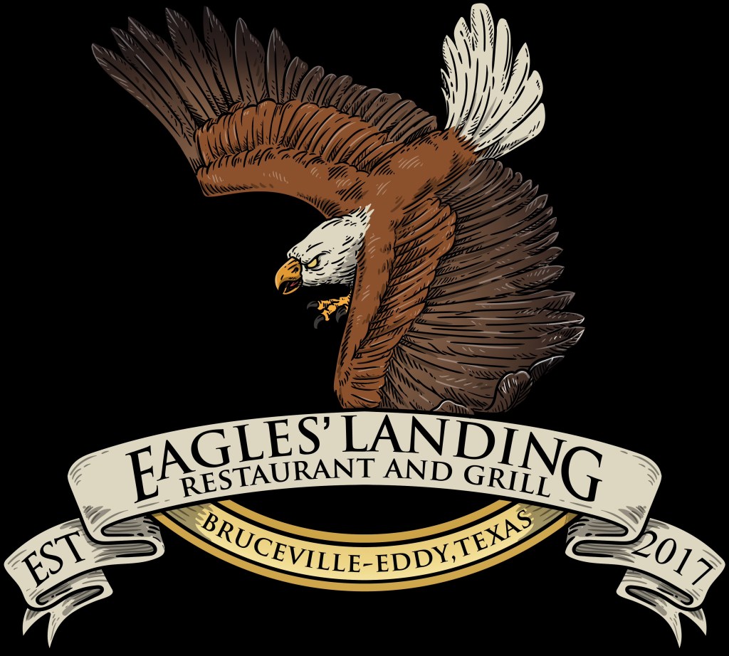
The Case of Eagles’ Landing Restaurant and Grill
An example of a successful colored logo is the Eagles’ Landing Restaurant and Grill logo, which reflects the business’s values and personality. The warm, earthy tones of yellows, golds, and browns evoke a sense of comfort, nature, and warmth, aligning with the restaurant’s focus on hearty meals and a welcoming environment. The eagle imagery reinforces the restaurant’s name and communicates feelings of power, freedom, and pride. This logo serves as a prime example of how color can enhance a design’s visual appeal and communicate a brand’s essence. Additionally, the logo is versatile, working well across various applications, from printed menus and signage to digital graphics and social media profiles. The bold, clear design ensures that it remains recognizable in different contexts, even when reproduced in a monochrome version. The importance of this logo, specifically, is that it’s okay to be complicated if the brand design is accurate and the customer is content.
Conclusion
Ultimately, business logos are a powerful tool for establishing a brand’s identity and connecting with its target audience. A successful logo is one that balances creativity with clarity, ensuring it is simple, memorable, and relevant to the business. Whether opting for a wordmark, lettermark, pictorial mark, or emblem, each logo style offers a unique approach to branding. The Eagles’ Landing logo exemplifies how a colored logo, with thoughtful use of color and imagery, can effectively convey the essence of a business while maintaining versatility and impact.

