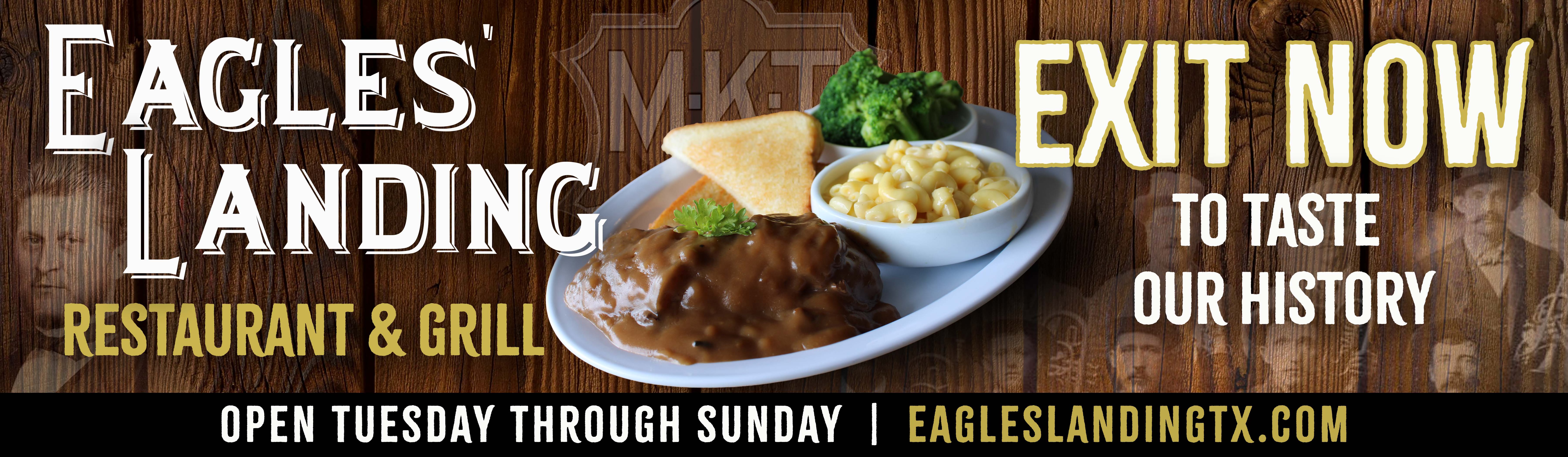
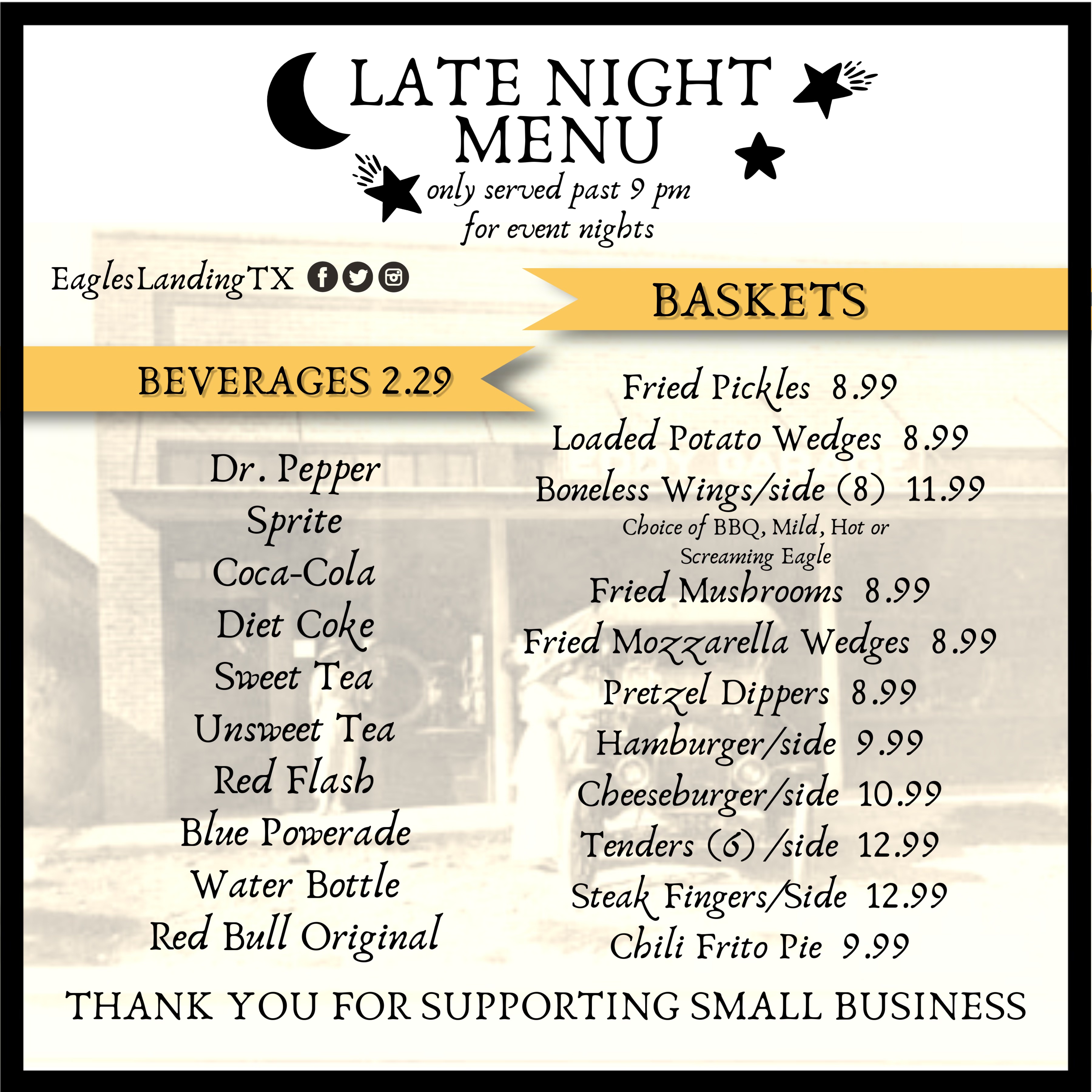
Eagles Landing Restaurant and Grill
Marketing and Media Manager
Side Gigs and Learning Projects
Sunset Surf Company Branding
Synopsis
The Sunset Surf logo recently underwent a redesign to create a more simple, modern look while retaining its colorful essence. Initially, the logo featured intricate details—waves, a shadow, and complex gradients—that captured the lively spirit of the surf culture. However, over time, it became clear that the design needed to be simplified to improve its versatility and overall impact.
In the new version, the intricate elements were pared down, leaving behind a cleaner, more abstract surfboard and wave graphic. The vibrant color palette was preserved, still representing the energy of the sunset and surf culture, but now in a more minimalistic form. This simplified approach makes the logo more scalable and adaptable across various platforms, while still maintaining the lively, dynamic feel that the brand represents. It’s a perfect balance of simplicity and color that enhances recognition and keeps the spirit of Sunset Surf alive.
02.12.22
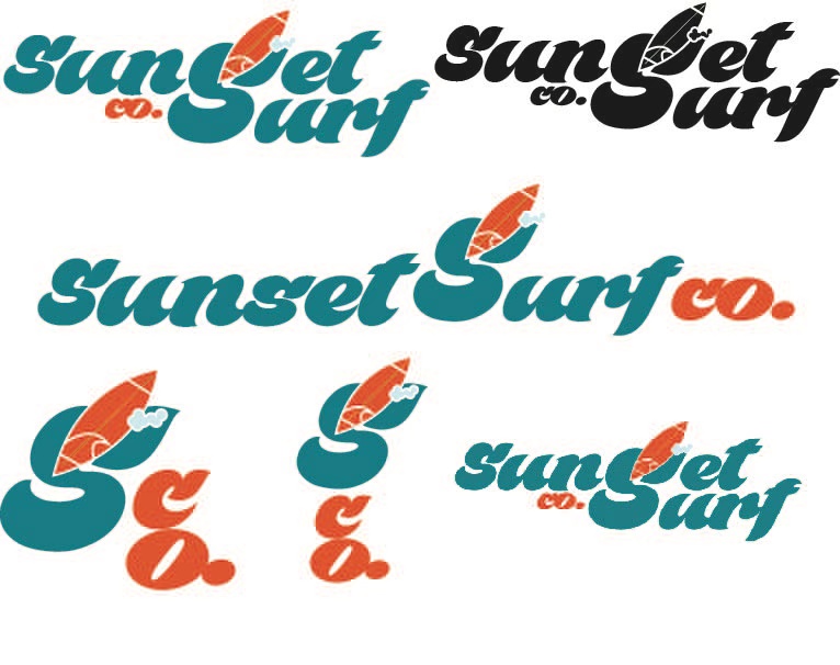
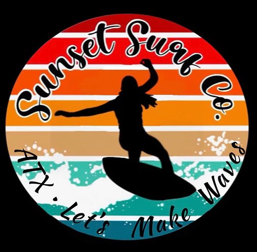
Small business, Sunset Surf Co. revised logo.
Picture 1: Updated Logo
Picture 2: Previous Logo
Book Cover Project
Synopsis
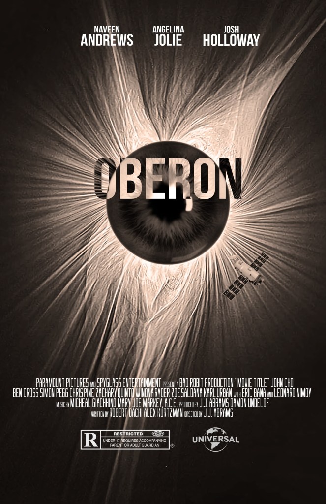
This poster for the film Oberon, created as a project in an advanced publishing class, is a striking example of minimalist yet impactful design. The central focus is a textured, abstract eye-like form that draws the viewer in with its radiating lines, evoking mystery and intrigue. The monochromatic color scheme enhances the dramatic tone, while the stark contrast emphasizes the eye as a key symbol. Subtle details, such as a spacecraft in the corner, hint at a sci-fi narrative, blending suspense with cosmic exploration. The bold typography for the title “Oberon” stands out prominently, balanced by the clean arrangement of the cast and production credits above and below. The overall composition conveys tension, curiosity, and an otherworldly allure, perfectly aligning with the film’s themes.
03.12.22
Military Unit Logo
Synopsis
This logo project for the Texas Army National Guard was designed to represent Alpha Company and was utilized throughout my deployment. The emblem combines bold, military-inspired elements with clean, impactful design to symbolize the strength and unity of the company. The layout features a sharp eagle at its core, embodying vigilance and leadership, while incorporating distinct typography and a shield motif that conveys protection and resilience. Designed to be versatile, the logo was used on various materials, from uniforms and equipment to official documents, creating a cohesive brand identity for the unit. This project highlights my ability to create functional and meaningful designs that resonate with a specific audience while maintaining a professional and impactful aesthetic.
05.12.22
Movie Poster Project
Synopsis
This personalized movie poster was created as part of a CMST 311 project at the University of Maryland Global Campus (UMGC) and showcases the power of visual storytelling. Designed to replicate the sophistication of Hollywood film posters, it combines striking typography, balanced composition, and a warm, romantic color palette. The poster features a couple as the central focus, with subtle design details that emphasize their connection and shared story.
What makes this project special is its versatility as a creative and sentimental wedding gift. By tailoring the design to a couple’s unique love story, it becomes a one-of-a-kind keepsake that celebrates their journey together. This project highlights the blend of artistic talent and design expertise, making it a standout in both academic and personal applications.
06.12.22

City Scape
Synopsis
This vector art project of a city skyline showcases the precision and creativity of digital illustration. Using advanced vector tools, the design features bold, clean lines and a harmonious blend of colors, creating a visually striking composition. The piece demonstrates the scalability and clarity of vector graphics, making it ideal for various applications like prints, branding, or digital media. This artwork would be great for merchandise, web design, or PowerPoint background and follows many design and art rules.
07.12.22

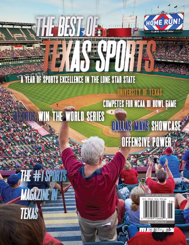
Magazine Cover Project
Synopsis
This project, created in my Electronic Publishing class, combines bold typography with a sleek, minimalistic design to make a powerful visual statement. Using advanced techniques in Adobe Illustrator and InDesign, I focused on creating transitions between fonts and shadow effects and a harmonious color palette that draws attention and engages the viewer. The goal was to design something both visually appealing and practical, demonstrating how powerful digital publishing tools can be when used with precision and creativity.
08.12.22
As we navigate the intricate tapestry of existence, we are constantly presented with choices, each a potential pathway to something extraordinary. This is a world where creativity knows no bounds, where the curious mind finds solace, and where the fearless heart discovers uncharted territories. It is a place where the pursuit of knowledge, the embrace of change, and the willingness to take risks are not mere options but essential ingredients for a life well-lived.
Welcome to a world of limitless possibilities, where the journey is as exhilarating as the destination, and where every moment is an opportunity to make your mark on the canvas of existence. The only limit is the extent of your imagination.
Please enjoy the fun projects I have completed personally, shown to the right.