Hello! Welcome to my first blog post.
Wedding invitations are more than just a piece of paper with details about the event—they are a reflection of the couple’s style, personality, and the atmosphere they wish to convey for their big day. In the digital age, creating a wedding invitation is an art form that involves a mix of traditional design principles and modern techniques. Whether opting for a bold, intricate design or a minimalist approach, the goal is always the same: to create an invitation that feels personal, special, and timeless. In this post, we will explore the techniques involved in designing wedding invitations, the importance of simplicity, and how to balance eloquence with elegance.
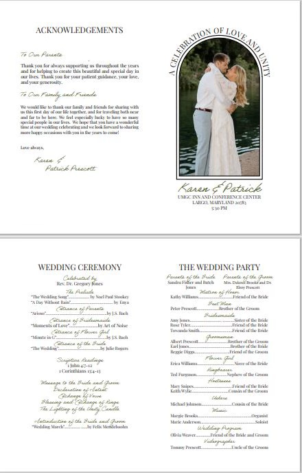
Synopsis of Wedding Invitation
For Karen and Patrick’s wedding invitation, I designed a timeless, single-fold layout that beautifully captures the elegance of their special day. The invitation features a minimalist black-and-white color scheme, offering a sleek and sophisticated aesthetic. On the front, an arched picture frame draws attention to a stunning photo of the couple, adding a personal and heartfelt touch. The simplicity of the design keeps the focus on the love story being celebrated, while the elegant typography brings an air of refinement. The compact format is both practical and stylish, making it a perfect way to invite guests to an elegant celebration.
The Basics of Wedding Invitation Design
Creating a wedding invitation starts with understanding the couple’s vision and preferences. For many, the invitation is the first glimpse guests will have of the wedding’s tone and theme. A well-designed invitation should provide information in a visually appealing way while reflecting the mood of the event. Here are some foundational techniques for crafting wedding invitations:
- Typography Choices Typography plays a vital role in setting the tone of the invitation. Fonts should reflect the formality of the event while being legible. A mix of fonts—typically one for the couple’s names and another for the rest of the text—can create an elegant and balanced design. Many designers recommend serif fonts for formal weddings and sans-serif for more modern affairs. However, it’s essential to ensure that the fonts complement each other and don’t clash, as too many font types can make the invitation feel chaotic (Henderson, 2017).
- Color Scheme Color choice should align with the wedding’s overall theme and the couple’s personal style. Soft pastels, metallic accents, and muted tones are often popular for formal weddings, while brighter, bolder colors may be appropriate for more casual events. The color scheme should also maintain contrast for legibility. For instance, white or ivory backgrounds with dark text tend to be easier to read and more elegant, while pairing darker hues for a more dramatic effect is common for evening events (Johnston, 2018).
- Imagery and Illustrations Incorporating relevant imagery or illustrations into the invitation is an excellent way to personalize the design. Some couples choose to feature botanical illustrations, abstract patterns, or images of the wedding venue. The key is balance—imagery should enhance the overall design without overpowering the text or drawing too much attention away from the essential details (Lee, 2020).
- Layout and Space A well-balanced layout allows the invitation to feel elegant without being overcrowded. A generous use of white space gives the design room to breathe and ensures that the text is legible. In particular, ensuring there is ample space between lines of text can elevate the invitation’s readability and sophistication. As Henderson (2017) suggests, a clean, spacious layout lends itself to an elegant, upscale feel.
The Importance of Simplicity in Wedding Invitation Design
While it’s tempting to incorporate as many ideas as possible into a wedding invitation design, simplicity is often the key to elegance. Overcomplicating an invitation with too many design elements or fonts can result in a chaotic look, which detracts from the message you are trying to convey. Simple wedding invitations, though, have a timeless appeal that always remains in style.
Simplicity does not mean blandness, however. A simple design can still incorporate intricate details in subtle ways. For instance, a monogram or a small, delicate illustration can add personality without overwhelming the design. Clean lines, minimal flourishes, and careful placement of text all contribute to a refined, eloquent invitation.
According to Lee (2020), simple designs often evoke feelings of calm and class. A minimalist design can make the wedding invitation feel like an extension of the event’s atmosphere—understated yet beautiful. Simple elements such as a monochromatic color palette or a single, elegant typeface can carry an air of sophistication that more elaborate designs sometimes fail to achieve.
Making Simple Designs Eloquent
While simplicity is key, it’s important to find ways to elevate minimalist designs and make them feel sophisticated. Here are a few techniques to make simple wedding invitations feel more eloquent:
- High-Quality Paper The choice of paper stock can make all the difference. Heavier, textured paper can make a simple design feel luxurious. Paper with a slight shimmer or a subtle pattern can add a touch of sophistication while maintaining a minimalist aesthetic. For example, cotton paper or linen texture lends a tactile richness to an otherwise simple invitation (Johnston, 2018).
- Foil Stamping Foil stamping is a beautiful technique that can elevate even the simplest of designs. By applying metallic foil to certain elements, such as the couple’s names or borders, you can add a hint of luxury without overwhelming the design. This subtle technique creates a sense of exclusivity and glamour, making the invitation feel special (Henderson, 2017).
- Letterpress Printing Letterpress printing involves pressing the design into the paper, creating an impression that can be both tactile and visually striking. This technique works especially well with minimalist designs, as it adds depth and texture without needing to rely on color or complex illustrations. Letterpress invitations have a timeless appeal and evoke feelings of elegance (Lee, 2020).
- Subtle Detailing Small details can make a big impact. For instance, a thin gold border, an embossed monogram, or a delicate ribbon tied around the invitation can add layers of sophistication without overwhelming the design. It’s the attention to these small details that makes a simple invitation feel polished and refined.
Conclusion
Creating wedding invitations is a delicate balance of art and design, where the goal is to reflect the couple’s style and create a lasting impression on their guests. While it’s easy to become overwhelmed by the endless possibilities, embracing simplicity can often lead to the most eloquent and timeless designs. A clean layout, careful typography, and a minimalist approach can elevate the invitation, making it feel sophisticated and special. By incorporating techniques like foil stamping, letterpress printing, and high-quality paper, wedding invitations can exude luxury without needing to be overly complex. After all, simplicity is not the absence of beauty but the essence of elegance.
References
Henderson, J. (2017). Designing for elegance: The art of wedding invitation typography. Wedding Design Press.
Johnston, M. (2018). Color theory and composition in wedding stationery. Design Studio Publications.
Lee, A. (2020). Minimalist wedding invitations: A trend that never goes out of style. Modern Design Journal, 12(3), 45-58.


Leave a comment